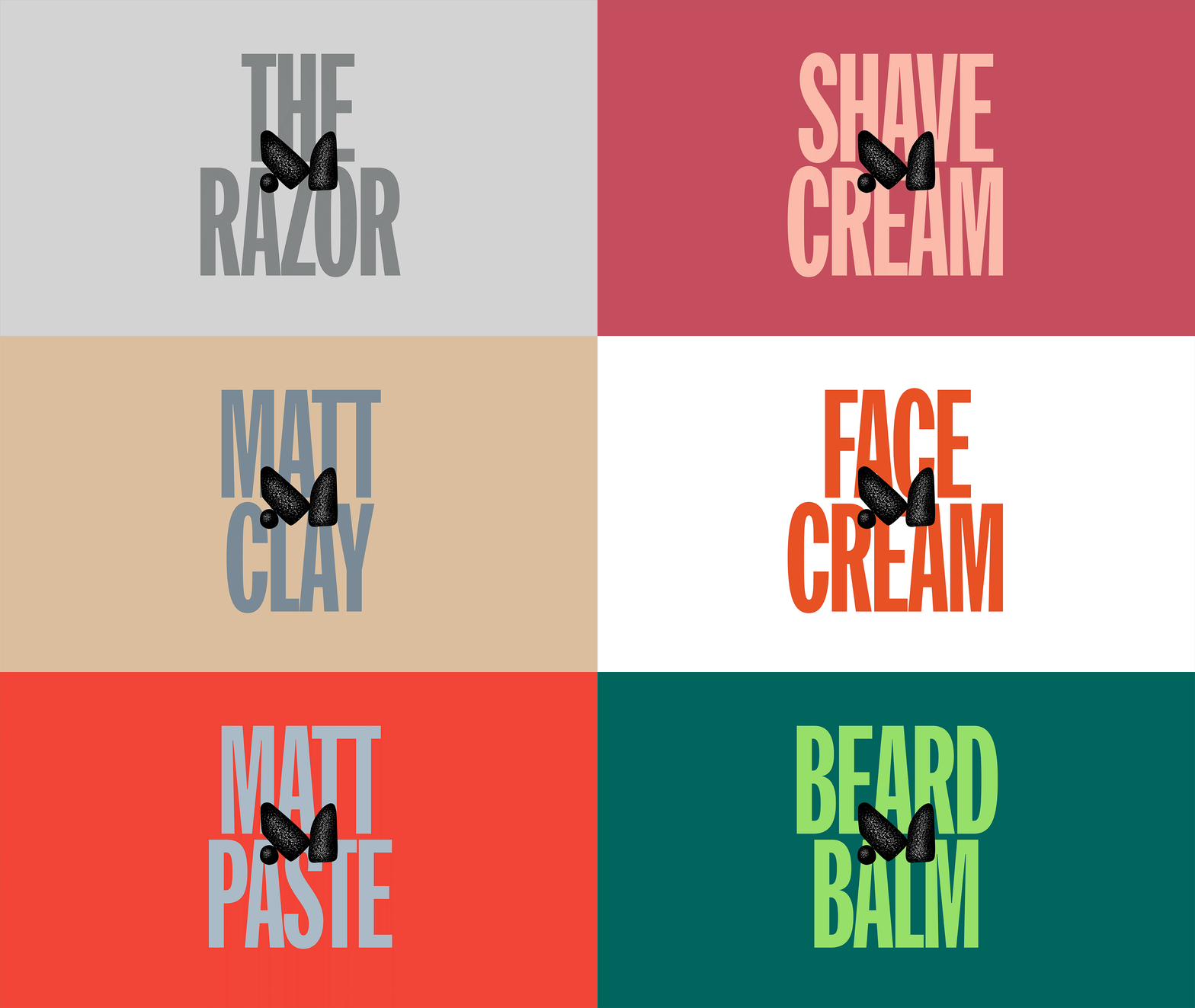
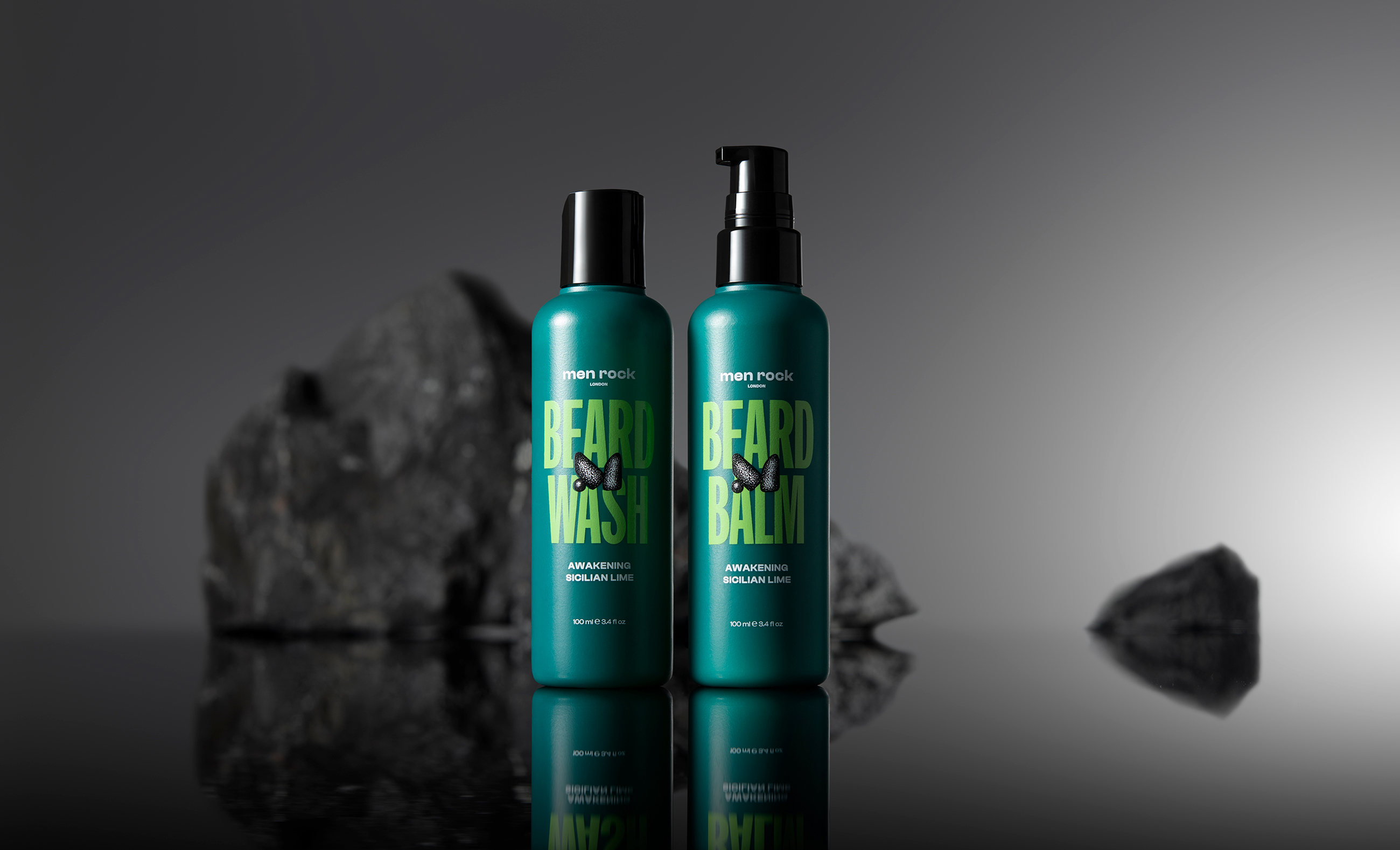
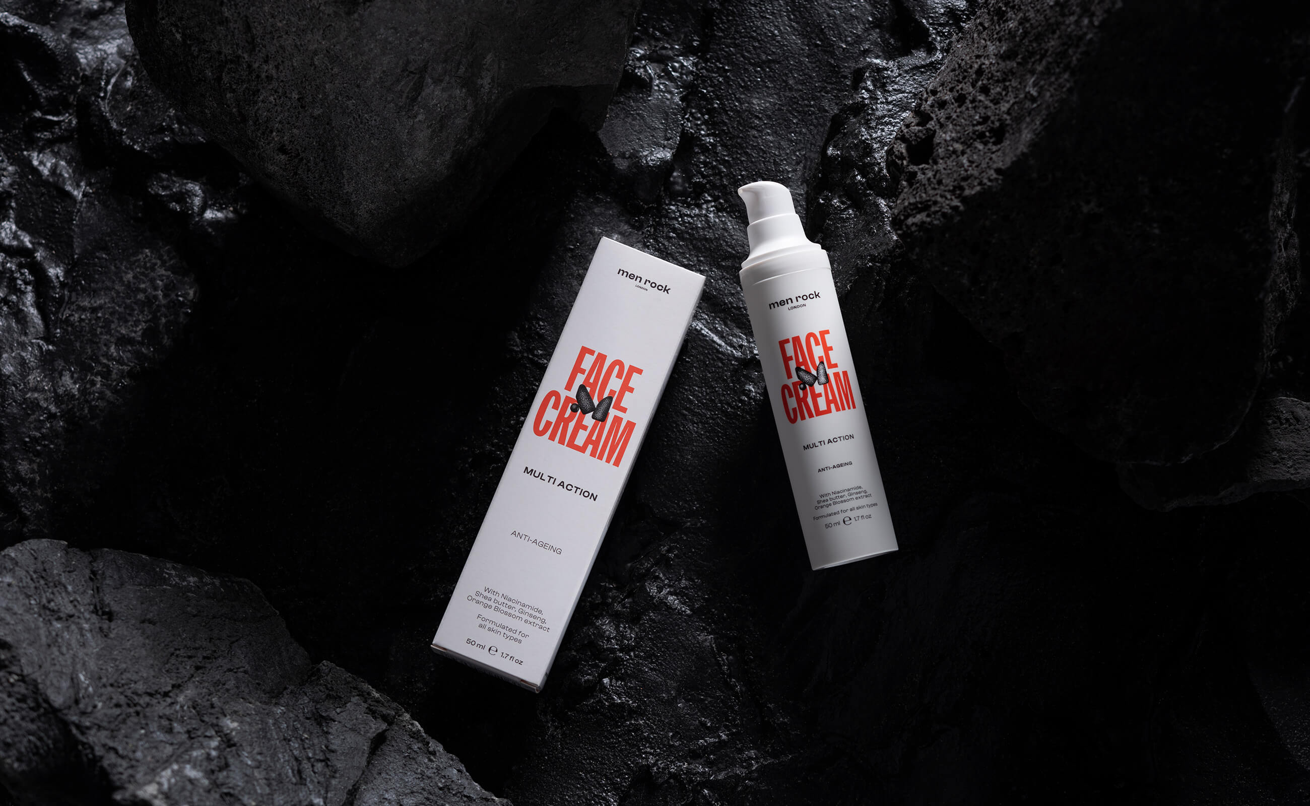
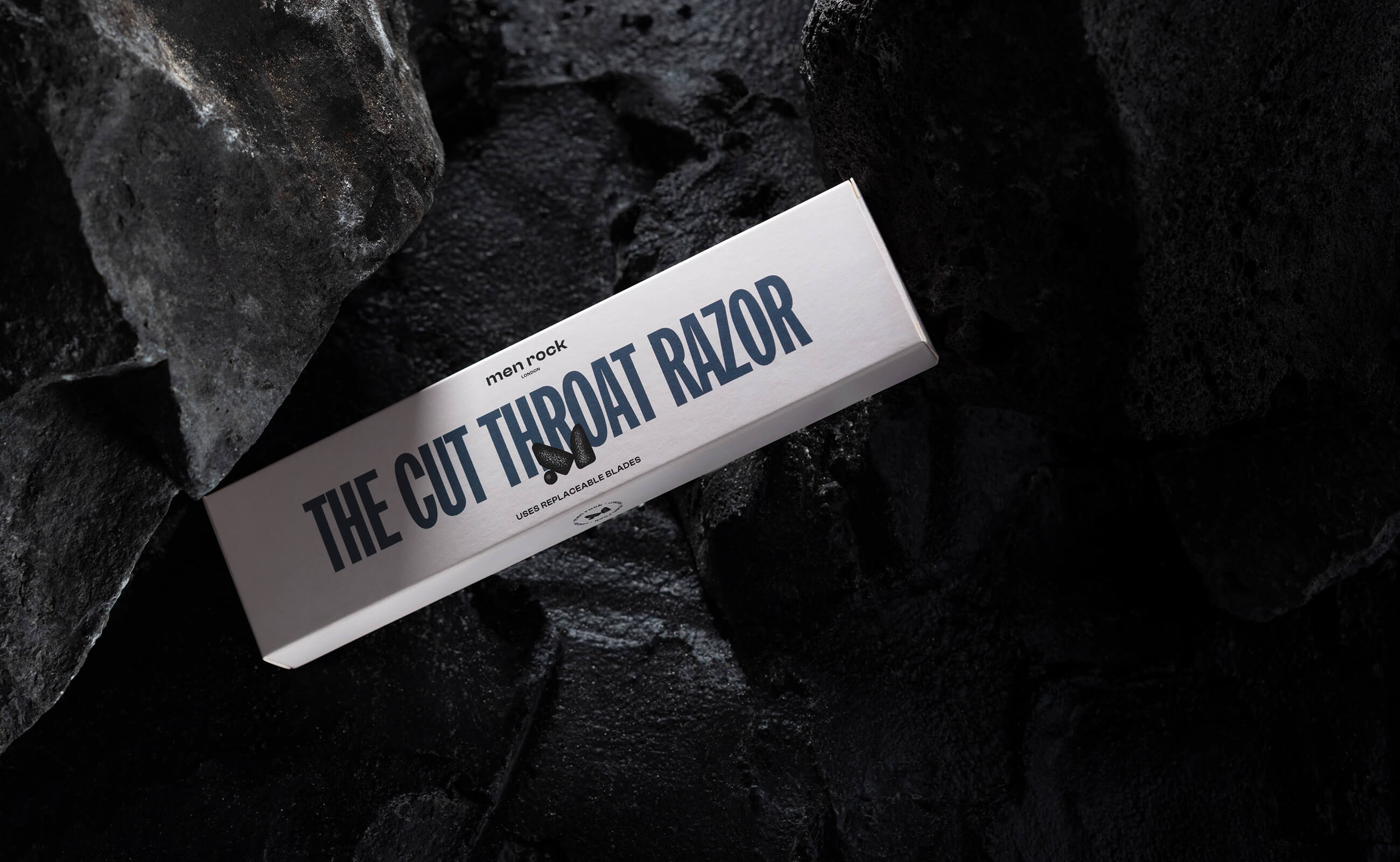
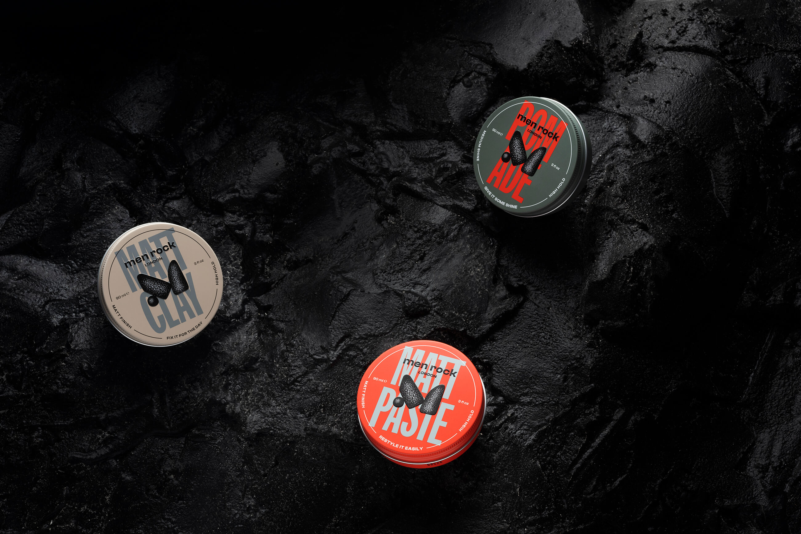
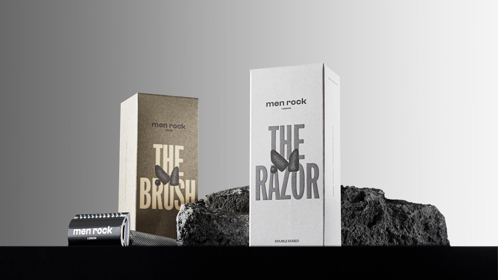
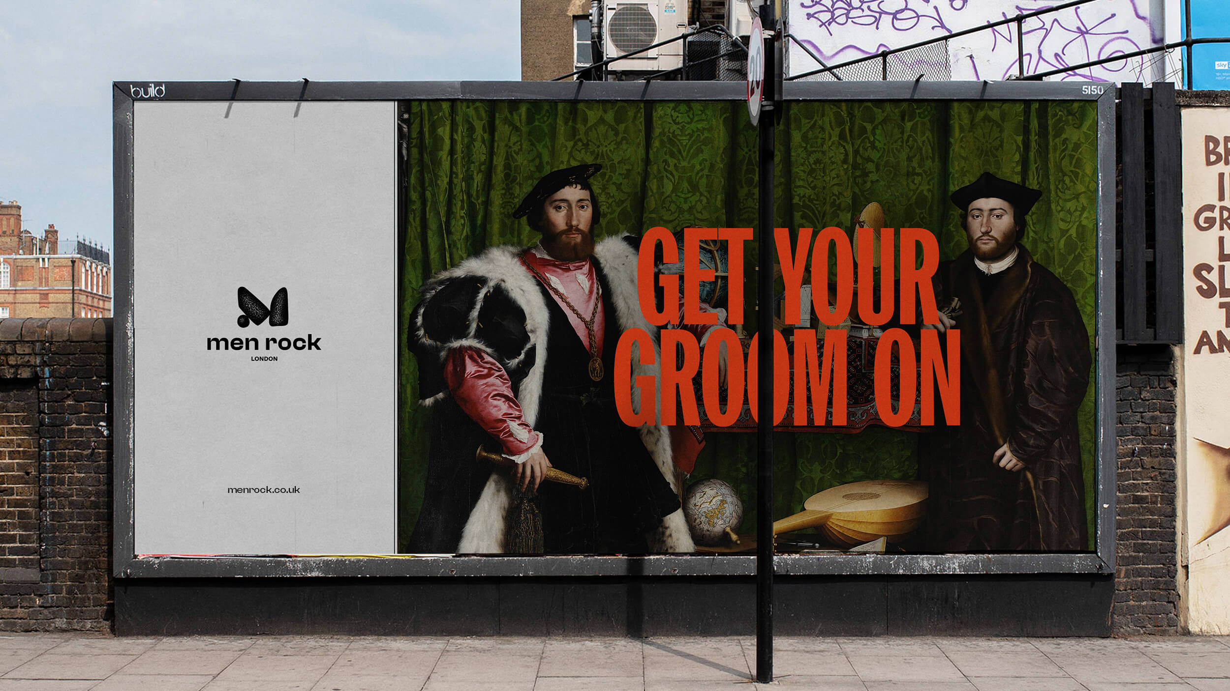
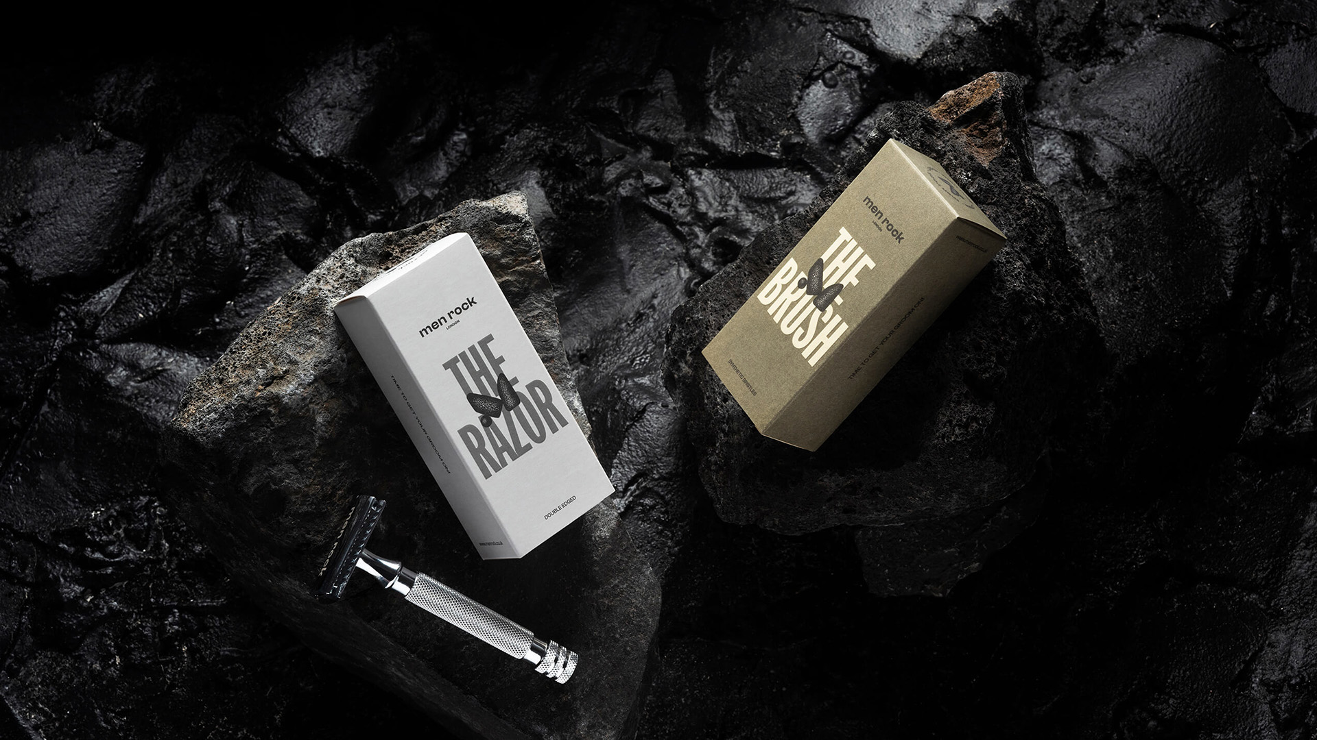
We created a design system, which is bold, outstanding, yet simple and straightforward in a good way. No pretentious naming, descriptions or headlines. Instead, the solid and highly legible titles, making it effortless and fun to choose and use the grooming essentials. On the one hand, it’s just practical. On the other hand, the bold statements symbolise the courage of the men to stay true to themselves.
Men Rock
Client: Men Rock
Project: Visual identity + Packaging
Year: 2022
Photography: Packshot.lt
- Services
- Art Direction
- Brand Strategy
- Graphic design
- Packaging
Men Rock is a line of quality easy-to-use men’s grooming products. This category is full of brands, that either look too generic or pretend to be over-sophisticated. Yet Men Rock wanted to declare that every man deserves more fun and a less complicated grooming routine. As simple as that. But how to manifest this with visual language?
The colours of the packaging reflect the colours of the product or its main ingredients. What you see is what you get, so it is easy to find the right product. Bold and vibrant colours also celebrate the unique characters of men around the globe and are created to brighten their daily routines.

